


AUDIT + DESIGN SOLUTIONS
A local bakery was struggling to turn online web traffic into brick-and-mortar storefront foot traffic. We decoupled the site from its rigid broken DIY template, built an image-first digital storefront, and turned passive browsers into paying local guests.
MY ROLE: PRODUCT DESIGN STRATEGIST
Industry
Food & Beverage
Business Type
Local brick-and-mortar
Business Model
B2C
The Problem
After reviewing the existing website, it became clear that its challenges were foundational rather than isolated usability issues. Instead of cataloging every usability issue, the audit prioritized the core improvements that would deliver the greatest long-term business impact.


4
HIGH PRIORITY
Foundational Experience & Conversion Blockers
Brand Identity & Design System
Information Architecture & Navigation
Content & Business Information Accuracy
Conversion & Customer Journey
4
MEDIUM PRIORITY
Usability & Engagment Improvements
Mobile Experience
Product & Content Presentation
Customer trust & Engagement
Accessibilty & Readability
2
LOW PRIORITY
Enhancement & Optimization Opportunities
Visual Polish
Experience Enhancements
Underneath all of it was one root cause: the site had never been built around what the business actually needed.
The Solution
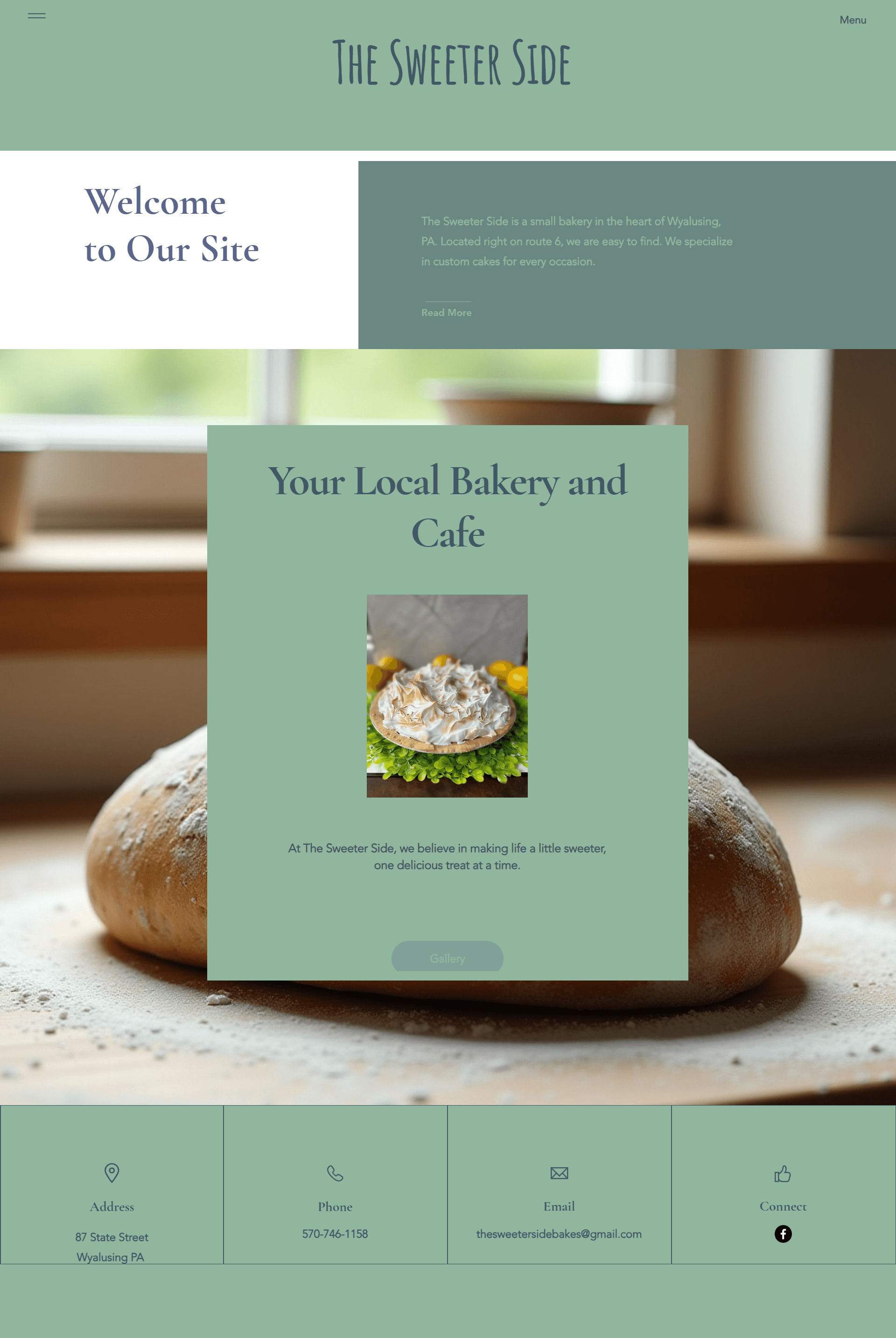
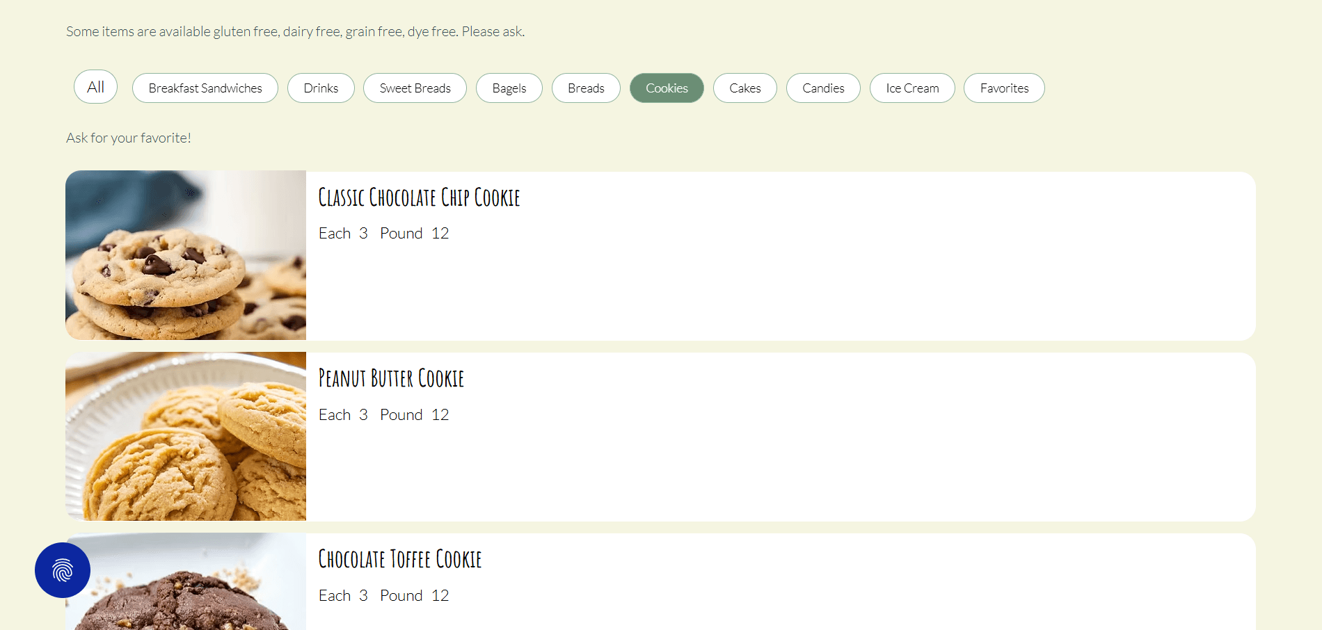
I rebuilt the site from the ground up in Wix Studio, this time working backward from the owner's actual goals — inquiries, wedding leads, a menu people could browse and crave, and easy class sign-ups. That meant:
A clean, consistent layout with real visual hierarchy, so customers could actually find their way
A starter brand kit: I rebuilt her original (and much-loved) logo as a clean vector file, and pulled a real color and typography system from it — something the whole business, including future materials, could stay consistent with.
Simple photo guidelines built for her specific situation, so she could take clean, matching product photos on her phone — including an AI photo-editing prompt she could use to bring older photos in line with the new visual style.
A warmer, more visual class registration experience in place of the old countdown timer.



Challenges Along the Way
She was overwhelmed, not indecisive.
Wix itself was the hardest part.
The Outcome
What started as a site nobody stayed on became a real digital storefront — one built around what The Sweeter Side Bakery actually needed: a place that makes people want to walk in, order a cake, or sign up for a class.
Feeling trapped in a template?
Let's build directly for your business and your customers.