
UX/UI AUDIT + DESIGN SOLUTIONS

From template
chaos to a
storefront that sells.

From template chaos to a storefront that sells.

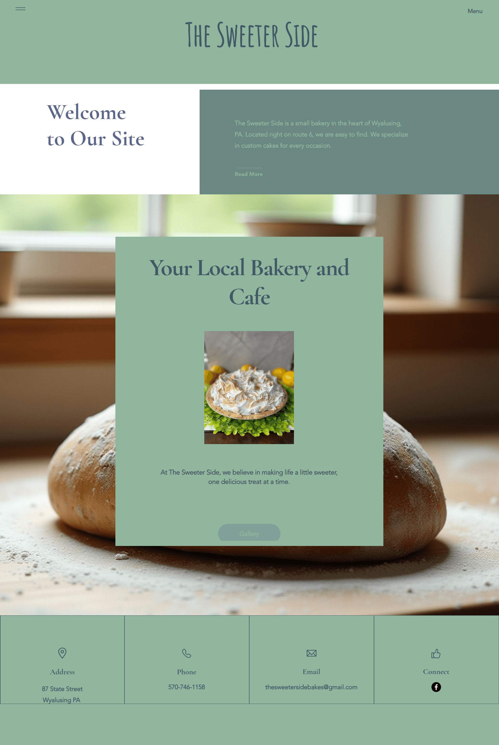
A local bakery was struggling to turn online web traffic into brick-and-mortar storefront foot traffic. We decoupled the site from its rigid default template, built an image-first digital storefront, and turned passive browsers into paying local guests.

MY ROLE: PRODUCT DESIGNER

+45%

In-store foot traffic

The numbers

The numbers

The numbers

After the audit and rebuild, the bakery's digital storefront delivered measurable outcomes within a single quarter.

+45%

In-store foot traffic

attributed to digital mapping

+62%

Seasonal menu click-through

on featured specials

+310%

Social cross-channel referrals

from native content hub

88%

Event/class capacity

sustained month-over-month

+62%

Seasonal menu click-through

on featured specials

+310%

Social cross-channel referrals

from native content hub

01 - ANCHOR

The business context

The project began by aligning the bakery's physical business goals with its digital real estate. The site was getting practically no traffic — with users bouncing instantly. The platform was working against the business instead of acting as a funnel.


Our goals were simple:

Drive in-store foot traffic

Scale local catering orders

Fill community baking classes

Grow social engagement organically

A neighborhood business, mis-served by a generic digital storefront.

02 - EXPERT WALKTHROUGH

The usability audit

Navigation & architecture mess

The Portfolio Trap

Template labels like “My Portfolio” and “Next Project” confused retail food patrons and damaged credibility.

Hidden Information

Operating hours, address, and daily flavor availability were entirely absent from the main view.

Device Disconnect

The desktop view forced users into a mobile-style hamburger menu with jarring hover interactions.

Missing visual appetite

Invisible Revenue Drivers

“Customer Favorites” and seasonal specials used heavy dark color blocks with zero product photography.

Dead Ends & Broken Integrations

Primary CTAs looped back to an incomplete menu. Social links misrouted users to default corporate platforms.

Fragmented event funnel

Information Isolation

Events mentioned “please look at beginner classes” with no link or category to find them.

Friction-Heavy Checkout

Registration stripped imagery and surfaced a cold details form with an abrasive countdown timer.

03 — DIAGNOSTIC REPORT

From template chaos to localized blueprint

The evidence was clear: the bakery didn't have a product problem — it had an information architecture problem. The blueprint pushed away from template gimmicks and toward an accessible, atomic grid system.

Hard-code bakery metadata into the header/footer so they are always easy to find.

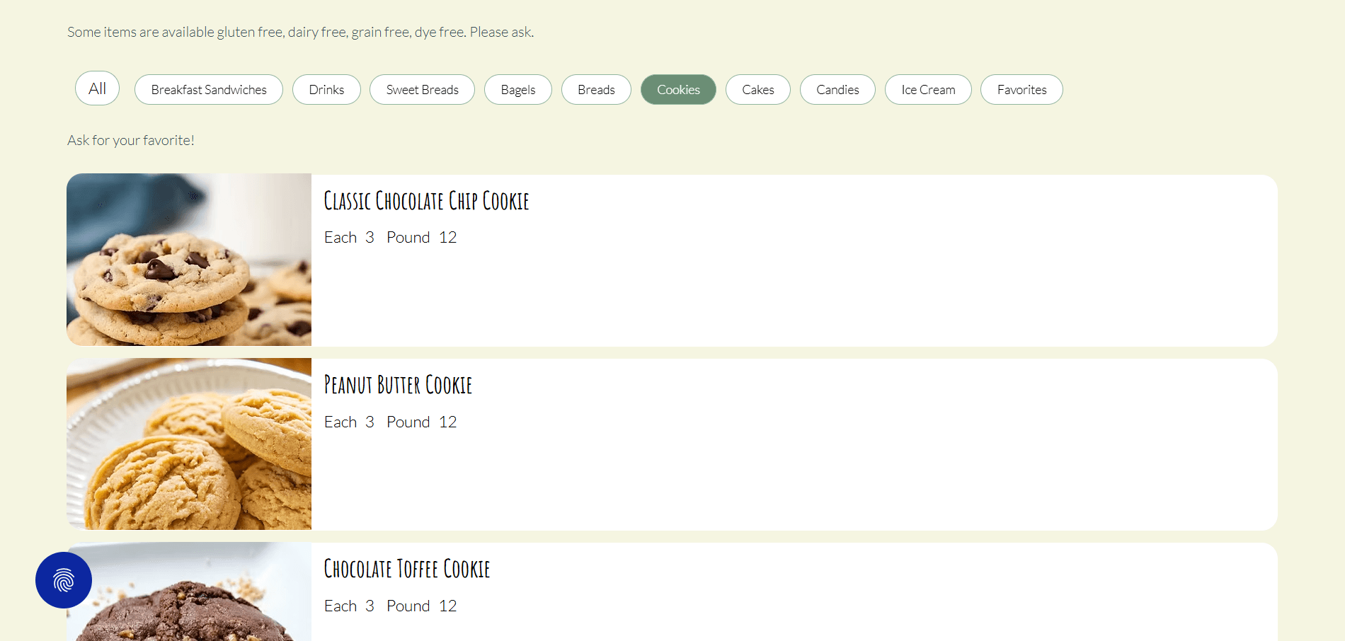
Create an image-first digital menu.

Establish a seamless, educational path to community event registration.

LEGACY TEMPLATE CHAOS

Hidden Nav

Few Product Images

Fragmented Menus

Broken Social Links

Drop-offs

NEW LOCALIZED BLUEPRINT

Flat Header

High-Density Food Grids

Unified Event Funnel

Resolved Social Links

Defeated Drop-offs

04 - EXECUTION

The design solutions

The interface was stripped of its rigid template and re-architected into a warm, structured digital storefront — built on the bakery's exact brand tokens.

BRAND TOKENS APPLIED

Dark green

#6A8782

Light green

#90B69E

Cream

#F5F5E1

Blush

#F4EBF1

Accent

#786FA1

NAVIGATION

High-density flat navigation

Axed the desktop hamburger. Installed an exposed top header with semantic links — Menu, Community Events, Catering & Custom Orders — and a right-aligned button for Find the Bakery.

MENU

Image-first menu architecture

Replaced dark text blocks with an automated grid. Every pastry shows a high-def delicious image, plain-English ingredients, transparent pricing, and dietary tags ([GF] [Vegan]).

COMMUNITY

The "social proof" hub

A dedicated section on the homepage mirrors the bakery's real-time Instagram and FaceBook content — anchoring trust and creating a gateway for future baking tips.

EVENTS

Optimized event registration

Real-time context (3 Seats Remaining), contextual links between beginner and advanced classes, and a local share button to text class details to friends.

FOOTER

Structured footer anchor

Consolidated to three operational columns: Logo & Hours · Click-to-Map Address & Phone · Verified Legal/Privacy links with unified punctuation.

COMMUNITY

The "social proof" hub

A dedicated section on the homepage mirrors the bakery's real-time Instagram and FaceBook content — anchoring trust and creating a gateway for future baking tips.

05 - RESULTS

Business Outcomes

+310%

Amplified social retention

Cross-channel traffic loop volume jumped — displaying community content natively turned casual buyers into active in-store foot traffic.

+45%

Surging in-store velocity

Digital-to-physical traffic scaled within the first quarter, driven entirely by the homepage location map and clear daily hours.

88%

Flawless event conversions

Baking classes reached sustained capacity. Eliminating registration dead ends. Doubled secondary workshop registrations.

+310%

Amplified social retention

Cross-channel traffic loop volume jumped — displaying community content natively turned casual buyers into active in-store foot traffic.

88%

Flawless event conversions

Baking classes reached sustained capacity. Eliminating registration dead ends. Doubled secondary workshop registrations.

+45%

Surging in-store velocity

Digital-to-physical traffic scaled within the first quarter, driven entirely by the homepage location map and clear daily hours.

+45%

Surging in-store velocity

Digital-to-physical traffic scaled within the first quarter, driven entirely by the homepage location map and clear daily hours.

88%

Flawless event conversions

Baking classes reached sustained capacity. Eliminating registration dead ends. Doubled secondary workshop registrations.

+310%

Amplified social retention

Cross-channel traffic loop volume jumped — displaying community content natively turned casual buyers into active in-store foot traffic.

06 - REALITY CHECK

Real-life challenges along the way

Challenge 1

Asset scarcity

Asset scarcity

The reality — Images drive bakery sales — but the client initially lacked high-quality photography.

THE FIX


Established strict component placeholder guidelines in Figma/Framer so the owner could safely capture consistent, well-lit smartphone product shots on a clean white background that match the canvas tokens.

Challenge 2

Client hesitation on simplifying services

The reality — The owner wanted complex, separate landing pages for “Special Occasions,” “Set Up,” and “Delivery.”

THE FIX


Used competitive research to demonstrate that grouping overlapping services under a single “Catering & Custom Orders” hub reduces kitchen overhead and stops user paralysis.

Challenge 3

Wix platform component limits

The reality — Translating advanced UI logic (dynamic filtering, share-to-SMS) inside basic Wix hosting can be restrictive.

THE FIX


Used clean embeddable custom HTML blocks and standardized native browser share sheets — keeping the setup low-code and low-maintenance for the owner.

Feeling trapped in a template?

Let's build directly for your business and your customers.

c

2026 SB - Product Design Strategist.

EMPATHETIC.

EMPATHETIC.

EMPATHETIC.

SYSTEMATIC.

SYSTEMATIC.

SYSTEMATIC.

OBSERVATIONAL.

OBSERVATIONAL.

OBSERVATIONAL.

EMPATHETIC.

SYSTEMATIC.

OBSERVATIONAL.

c

2026 SB - Product Design Strategist.

c

2026 SB - Product Design Strategist.

EMPATHETIC.

SYSTEMATIC.

OBSERVATIONAL.

c

2026 SB - Product Design Strategist.

EMPATHETIC.

SYSTEMATIC.

OBSERVATIONAL.